Can
you see the Music?
As album cover art shrinks
with high-tech gadgets, bands and labels try to keep it alive
By Ricardo Baca Denver
Post Pop Music Critic, April 2, 2005 The Denver Post
(This Article is continued from PhonoLinks <--
Click here to Return)
Album
cover art may be in transition, but it's far from dead.
There has always been an
intimate connection between music and the art on its cover. Album art, a long-celebrated
vehicle for visual and musical artists, has changed dramatically over the past
three decades as its canvas has shrunk. But, with apologies to Mark Twain, reports
of its death are greatly exaggerated.
Imagine album art traditionalists
today, looking on in revulsion as their children see, for the first time, the
artwork for the new Yeah Yeah Yeahs, roughly 1 by 1 inch on the miniscreens
of their iPods.
"It's just sad, because
the visual side of music always has had such an influence on the way you hear
a record," said Geremy Jasper, lead singer for punk band the Fever, who maintains
a special relationship with the cover to Tom Waits' "Rain Dogs." "The way a
record looks should influence and direct and contextualize the way you listen
to a record. They work hand in glove, and that seems to be gone."
The magic of album art
isn't gone so much as it is hard to see - without glasses, at least. There's
as much creativity and beauty in cover art today as there was in the 1970s -
maybe more. But through the glare of a jewel case or the scratches on an iPod
screen, it doesn't look nearly as majestic as it once did.
"As someone who feels that
pop music is an art, I think that the packaging for the music itself should
be artistic," said Josh Rosenfeld, co-founder of Seattle indie label Barsuk
Records, home to Death Cab For Cutie, Nada Surf and Rocky Votolato. "It's the
Luddite in me, in a way. I still like stuff. When I was younger, I was a total
record-collector geek, and the objects had meaning, in a way, and it's hard
to tell whether it's some weird materialistic, unflattering human impulse to
collect (stuff) that I was excited about or the love for the music that was
imbuing the packaging with added significance."
Rosenfeld isn't happy
with most labels' treatment of cover art in this transition to smaller and digital
mediums.
"I'm in the mourning party,"
Rosenfeld said. "I love LP art. CDs are such a pale, little subversion of that."
It was one thing for a
cover's real estate to be downsized by more than 75 percent from a 12-inch-square
LP cover to CD. At least it was still tangible - a physical product you could
hold in your hands and enjoy in different ways. From booklets to poster foldouts,
bands and labels often got creative with the packaging.
But now, as iTunes scrambles
to create a legitimate, compatible, interesting way of presenting cover art
(and liner notes, lyrics and everything else that have been mainstays in recorded
music since the 1950s), industry insiders are contemplating this transition
to an all-digital medium that doesn't involve printing presses or record stores.
"Right now our albums are
just a bunch of text on these iPods, which is a heartbreak," said the Fever's
Jasper, who also created the cover art for its upcoming CD "In the City of Sleep."
"It seems ridiculous -
really, really ridiculous. But it's kind of where American pop culture and society
are going. Anything that's handmade or aesthetically interesting is thrown out,
tossed out the window."
The connection between
a band and its artwork is akin to the relationship between the group and its
music. A band is almost always involved in the creation of a CD cover, especially
on the independent circuit, where the guitarist's girlfriend (or singer's brother,
as is the case with the upcoming Shins record) is likely the chief designer.
Some of the larger indie labels, and all of the majors, have art departments
that work with bands to create a vision.
"We've done two records
with Rogue Wave now," said Jeff Klein- smith, art director for 12 years at Sub
Pop Records, home of Postal Service, Mudhoney and Iron & Wine, and former home
to Nirvana, Soundgarden and Denver's the Fluid.
"(Lead singer Zach Rogue)
called me up the first time around and said, 'This is the vibe, this is my concept
for the album, this is the direction I'd like to go in.' I sent him a bunch
of ideas. He liked some of them, he didn't like some of them. And it hurt my
ego, but it also pushed me into doing something that he and I were both very
happy with. "For the second album, he had a dream about what the album cover
should look like. I interpreted that and gave it to him. And he was really in
tune with it."
Sub Pop, like fellow mega-indies
Matador and Merge, still prints respectable runs of nearly every artist on vinyl.
It's something bands and fans appreciate.
"Matador still puts out
everything on vinyl," said Mark Ohe, the art director at Matador Records, home
to Interpol, Superchunk and Yo La Tengo. "We'll sell, for example, a respectful
amount: 4,000 to 5,000 on vinyl, 20,000 on CD. ... A lot of record companies
would say it's not worth it because our profit margin is next to nothing. But
most bands are really jazzed their record's coming out on vinyl."
But whether fans are seeing
a band's cover art for the first time on an LP sleeve or an iPod screen, at
least manufacturers such as Apple and art-integrating software gurus CoverBuddy
are keeping the art involved and linked to the music.
"I think it's awesome that
the people who are making digital music players are concerned enough with album
art to make that a possibility," said Sub Pop's Kleinsmith, speaking of the
iPod's on-screen mini-art. "It's silly that you're seeing this little inch-by-inch
thing, but you're still connecting the music with the art."
Some artists are running
with new media rather than fighting it. Conrad Keely wasn't busy enough with
his own band, Austin's ... And You Will Know Us by the Trail of Dead, and so
not only does he manage all of the band's artistic endeavors, cover art included,
he also shows his own art and creates work for other bands. His most recent
piece graced the cover of "Age of Winters," the debut CD from The Sword, an
Austin, Texas, guitar rock quartet.
"Artists have the ability
and drive to create art no matter what the obstacles may be," Keely said. "And
people are being just as creative now with the limitations as they ever were
with LPs.
"As the fan of music that
I used to be, I would get interested in every aspect of the band, including
their art. If I saw a small version of the cover, I'd race online to see the
big version. Especially when you have a little cover with a lot of detail, you're
going to want to blow it up and say, 'Wow, what is that going to look like?"'
Some make the case that
the Incredible Shrinking Album Art is worse for fans than it is bands or artists.
"I don't think it limits
you as a designer," said Matador's Ohe. "I think it limits the experience of
the music buyer. I've got a thousand or couple thousand LPs at home, and they're
fun to pull out like big magazines and flip through them, look at the front
cover and back cover and see what's in there printed on the insert and dust
sleeve or miniposter. That's a lot of fun to experience."
Morgan Phalen, singer for
the throwback '70s rockers Diamond Nights, agrees. But as the artist behind
both the music and the album covers, it's painful to see it shrunk to the size
of a postage stamp.
"My brain lives in the
LP generation, but I'm living in the iPod generation," said Phalen, who collects
record art, physically in his home and virtually on his laptop. "So my favorite
record covers are all LPs. I actually collect record covers, and I have zillions
of them. A lot of times I don't care about the band. Gentle Giant - I'm not
a fan of that band, but they have great covers."
Diamond Nights' debut full-length,
"Popsicle," features a painting of a nebulous galaxy, with a subtle skull (composed
of cosmic debris) in the upper right corner. It's taken from one of Phalen's
old compositions, and "It was the perfect expression at the time," Phalen said.
"We wanted this record
to be a radio transmission from an alternate dimension, something that sounded
just like the world you lived in but nothing recognizable - a strange, amorphous
galaxy, neither sky nor outer space."
You're not going to get
that on first look, but it's something that would be more evident were the CD
jacket blown up three or four times larger.
"If you put an LP sleeve
in your lap or hold it up to your face, you can visually enter some kind of
world that the recording artist dreamed up, just him and his designer friend,"
said Matador's Ohe. "The graphic's going to take up more of your vision, and
that can really take you somewhere."
ALBUM ART: YOU CAN
JUDGE A CD BY ITS COVER
The album cover is no
dying art with the indies
The artists creating the
most provocative album art in music today are often on indie labels. Here are
five CD covers that have recently turned heads:
| Death
Cab for Cutie, "Plans" (Barsuk/Atlantic): What exactly is that amorphous
orange item dominating the cover? Exactly. The balance of focus and color,
along with the near-transparent fonts, creates an image that works for Death
Cab's soft indie leanings. |
 |
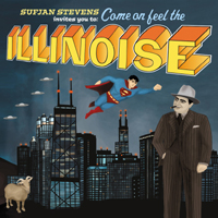
| Sufjan
Stevens, "Illinois" (Asthmatic Kitty): Already a classic album cover
- with the controversy to match - "Illinois" is a simple work featuring
iconic Chicagoans, UFOs and a goat. Initial printings included a flying
Superman, above, but DC Comics licensors made sure distribution of that
version came to a quick halt. |
 |
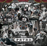
| The
Fever, "In the City of Sleep" (Kemado): This epic collage, to be released
April 25, is a masterwork by the group's singer, Geremy Jasper. In LP form,
it's a gazer. As a CD cover, you'll miss a lot, but it's still good fun.
On your iPod? Forget about it. |
 |
|
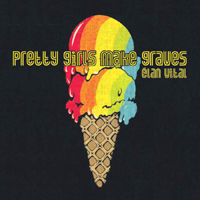
Pretty Girls Make
Graves, "Elan Vital" (Matador): In one of their many thrift-store
excursions while on tour, Pretty Girls found the fabric with this sweetly
psychedelic design, which adorns a record out on April 11. It fits the
group's saccharine nature and occasional retro indulgencies ideally. (The
band plays Denver's Marquis Theatre on April 29.)
|
 |
|
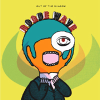
Rogue Wave, "Out
of the Shadow" (Sub Pop): Both Rogue Wave LP covers are creations
of Sub Pop's art department with input from the band, and both are excellent
examples of artistic collaborations. If you've ever heard this band, you
know the funky lettering and abstract, almost-bright art fit it to a T.
|
 |
PhonoLinks
<-- Click here (or click
Back on Browser to return to page location)